Making Autumn Background Replacements Look More Realistic
Discover how to use an AI background replacement tool to create realistic autumn scenes that bring warmth and depth to your photos.

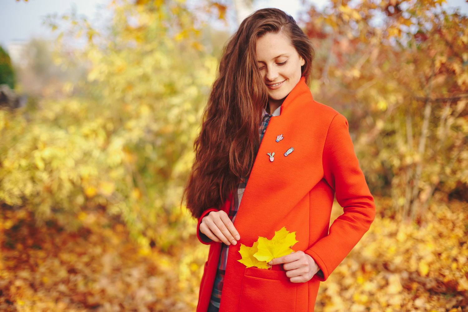
Autumn is one of the most visually rich times of the year with its fiery leaves, soft golden light, and cozy outdoor vibes. When replacing backgrounds in photos, fall scenes can add warmth, depth, and mood. But there's a catch. If the editing looks off or doesn't blend well, even the prettiest leaf scene won’t feel authentic. That’s where using the right AI tools with the right techniques can make a big difference.
Not all background swaps are created equal. Replacing a dull or mismatched scene with an autumn backdrop might sound simple, but getting it to look believable takes more than just layering the image. Getting the shadows, color tones, and depth right helps the final image look like it was actually taken on a crisp fall day. Here’s how you can improve that process and avoid the common pitfalls that make a background replacement stick out in the wrong way.
The Importance Of Realistic Backgrounds
Your eyes know when something doesn’t feel right. Even if you can’t explain it in words, you’ll know if a photo looks fake. A clean, sharp subject dropped into a mismatched background with off lighting or color temperature will stand out—and not in a good way. The goal is to make the new background feel like it’s always been part of the image. That comes down to matching edges, shadows, and small details for a natural feel.
Realistic backgrounds help tell the visual story. When it all comes together, they support the mood of the picture, make it more appealing, and add dimension. A fall photo filled with rich-colored trees and soft natural light can bring feelings of warmth and nostalgia into focus. To make that happen, the transition between the subject and the background needs to be seamless.
While AI background replacement tools can speed up editing, they’re only as effective as the way they’re used. Choosing the wrong setting or using an image that doesn’t match in lighting or color throws off the final result. Many tools offer helpful features like shadow blending and color tone matching, which go a long way toward more lifelike edits.
Let’s say you’ve got a portrait taken indoors. If you want it to look like it was snapped in the middle of a forest during peak fall, you’ll need more than a pretty tree background. The direction of light, warmth of the colors, and contrast values all need to align. The right tool will help you fine-tune those elements until the entire shot feels like one cohesive photo.
Tips For Picking the Best Autumn Backgrounds
Choosing a great background is one of the biggest steps toward a stronger final image. Even with quality AI features that help blend subjects to new settings, starting with the right scene makes everything go smoother.
Here are some tips for selecting fall-themed backgrounds that actually work:
- Pick high-resolution images. A clean, sharp background is just as important as the foreground. Stay away from blurry or over-filtered photos.
- Focus on lighting. The lighting in the background should mimic the lighting in your original photo. If your subject is lit from the left, pick a backdrop with similar light direction.
- Look for color consistency. Warm golds, oranges, and reds should match your subject’s clothing or skin tone. Avoid harsh contrasts in tone.
- Keep the angles in check. The depth and angle of the background should match your subject’s perspective. Otherwise, the result will feel off.
- Make sure the setting fits. Outdoor fall scenes look great with portraits taken outside. But if your subject was clearly shot indoors, a forest scene might look out of place.
Matching tones and lighting isn’t just about what looks pretty. It’s about helping the brain believe that everything in the photo exists in the same space. Softer backgrounds with natural gradients and subdued skies tend to work better than ones with harsh contrasts or strong directional light. The more natural the backdrop feels, the better the final image will look.
Using AI Background Replacement Tools To Achieve Realism
Once you’ve chosen the best autumn background, using an AI background replacement tool becomes much easier. This part is more than just cropping and pasting a subject. There are several features and adjustments that make the final image look like it was taken all at once, in one place.
Here’s a simple process that can help:
1. Upload your original photo and choose the autumn background you want to use.
2. Check that the subject is sharp and clean. If not, use tools for edge refinement or background erasing to improve accuracy.
3. Make the lighting direction match. If the background has light coming from the right, you’ll need to add shadows or brighten the right side of the subject’s face to match.
4. Adjust overall color temperature. If your subject feels too cool compared to the warm background, shift the tones slightly to blend better.
5. Apply blur and depth effects. A soft out-of-focus background often looks more realistic and mimics how a real lens would shoot fall photos.
A good tool should offer lighting controls, shadows, and smooth edge blending. These may sound like small details, but they make a big difference. Slight tweaks to match shadows or highlights can decide whether the viewer believes the image is real. Take time to review your first version, and don’t be afraid to redo a setting that doesn’t look quite right.
Common Mistakes To Avoid In Autumn Image Swaps
Some of the most common problems in background replacements happen because a few easy-to-miss details were ignored. If these areas are overlooked, it can pull the viewer out of the photo and reduce the emotional impact you were aiming for.
Make sure to avoid these mistakes:
- Low-quality background images. Poor resolution makes the background look fake next to a high-quality subject.
- Lighting mismatches. A subject with soft shadows won’t match a background with bright, directional sunlight.
- No shadows at all. Subjects look like they’re floating if the scene has no grounding shadows.
- Overdone color tones. Too much warmth or saturation makes fall colors look fake rather than cozy.
- Harsh outlines. If the subject’s edge is too sharp or obvious where the background meets, it screams “edited.”
For example, take a portrait that was shot under indoor fluorescent lighting. Trying to place that person into a sunny fall forest with glowing orange trees won’t work unless you fix the lighting difference. Even if everything else is lined up, the mood won’t match. Fixing things like white balance, shadows, and blending around the edges helps tie everything together.
Make Autumn Photos Feel Just Right
There’s a reason fall-themed images are so popular. The colors, the atmosphere, and the emotion they bring out are hard to resist. But creating those images takes more than copying a photo into a fall-colored background. The secret is in small details—light direction, tone harmony, and believable shadows.
AI background replacement tools help speed things up, but it still takes a little thought to get it just right. You don’t need to be a pro, but knowing what makes an edit feel authentic makes all the difference. When a picture looks like it was taken as a single moment in time, it feels more real and more memorable.
Think of editing as storytelling. The more natural everything feels in the photo, the more likely someone will connect with what you’re showing. A few extra minutes matching shadows or picking the right leaf-filled backdrop can make your photo stand out for all the right reasons.
Creating stunning autumn images is possible with the right tools and a keen eye for details. As you hone your editing skills, consider using an AI background replacement tool to achieve the perfect blend of nature's fall beauty with your photos. Check out MagicEdit to explore how our technology can bring your images to life with seamless transitions and realistic effects.